
How I Redesigned Drank’s Website to Align Their Brand, Improve UX Clarity, and Support App Growth
The Problem
Drank’s website no longer reflected their evolving business. Originally focused on mobile ordering for breweries, they had expanded into coffee shops and eateries, but their web presence felt fragmented, lacked visual professionalism, and failed to guide users clearly toward downloading the app. They needed a redesign that would unify their brand voice and build a flexible foundation for growth.
My Role
As the UX Designer, I led the end-to-end process:
Facilitated discovery and brand alignment workshops
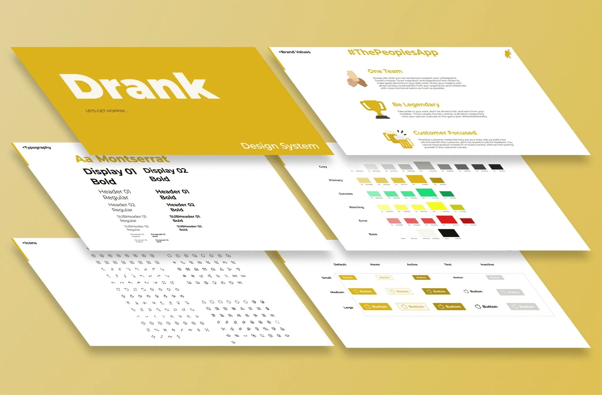
Developed a scalable style guide and design system
Crafted UX strategy, wireframes, and high-fidelity designs
Collaborated iteratively with a visual design partner
Discovery: Aligning Brand Identity Through Conversation
In our first stakeholder session, Drank described their brand as having “a split personality.” Instead of rushing into design, I led a discovery workshop to uncover their core values, user personas, and evolving business goals. This slowed-down, thoughtful approach helped us align on a clear brand narrative that guided all design decisions and prevented costly rework.
By slowing down and asking better questions, we aligned the team around a single, clear narrative that would shape both tone and structure. This clarity saved time downstream and prevented conflicting design decisions later.

To anchor the design in real goals, I asked:
What is Drank’s core value today?
How do you want to stand apart in a growing competitive market?
Who is your audience as you scale?
What tone and personality do you want to convey?
What does long-term success look like?
From Style Guide to Design System
What started as a simple style guide quickly evolved into a full design system. The existing brand had only one official color, Drank Gold, so I created a complementary palette including Drank Black, Off-Black, and Off-White, establishing visual hierarchy and flexibility.
This system not only streamlined the website redesign but also provided a reusable foundation for all future digital touchpoints.
Key additions:
Switched font from Nunito to Montserrat for stronger typographic presence
Designed iconography and reusable UI components (buttons, navigation, CTAs)
Integrated the new logo consistently across elements
Set spacing, color, and typography standards to guide future web and app design
Collaborative Concepting and Iteration
Partnering closely with a visual designer, we brainstormed multiple homepage layouts focused on two goals:
Drive immediate app downloads
Highlight key features that differentiate Drank

After presenting several wireframes and sketches, the team chose a hybrid concept which I translated into polished, accessible high-fidelity designs. Key features included:
Clear, prominent CTAs visible immediately on page load
A scrollable journey that communicated real product benefits
A warm, modern, and authentic visual language
Iteration & Design Adjustments
After our first round of feedback, I made several adjustments to better align the experience with user expectations and business goals:
Replacing the carousel with static card layouts to improve readability and reduce motion fatigue
Swapping out outdated app screenshots for imagery that humanized the experience
Adding a simple “Three-Step Process” to demystify how the app works
Switching from a “Contact Us” form to a chatbot and email option for better support
Ensuring button consistency and accessibility in both light and dark modes
These iterations ensured the site was effective, user-friendly, and scalable.


Outcome
The redesign delivered:
A cohesive brand identity aligned with Drank’s expanded market
A clear, persuasive user journey driving app downloads
A flexible design system supporting future growth
Professional visual clarity balanced with brand warmth
Measurable increases in app downloads following launch
Drank valued the process so highly that I was invited to contribute to the mobile and web app design phases, proving that my strategic, systems-minded approach resonated beyond the website.


Reflection
This project reinforced how strategic pacing in design can save time and elevate outcomes. By taking time to ask better questions upfront, we avoided unnecessary churn and built a solution that serves both the brand and its users long term. Beyond a visual facelift, this was about building scalable foundations, aligning around a unified vision, and delivering work that will grow with the company.